
The NBA just released the 2022-2023 City Edition Jerseys so it’s time to rank them. I decided to go with a tierlist concept rather than a straight up rankings because it felt more fitting. There are a few design principles that I held the jerseys to. First, the jersey should be fitting within the team’s existing design and color scheme. Maintaining the classic looks of the franchise is important. Second, I decided that I didn’t care too much about the backstory of the jersey (see: Suns). Third, does it look cool to me, a very important design principle.
If you disagree with may rankings feel free to send me back your own tier list (you can make them here).
S Tier: The Cream of the Crop
Brooklyn Nets
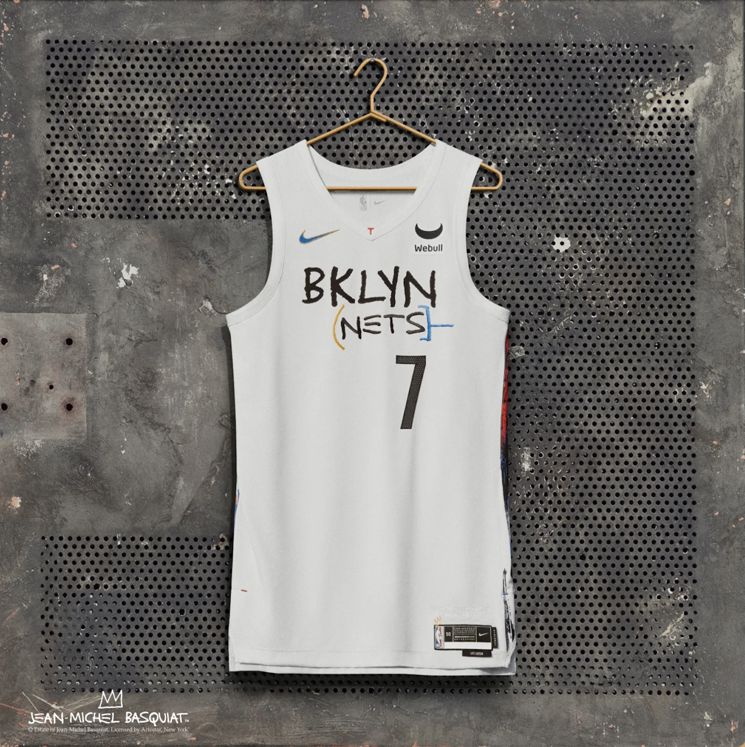
For my eyes, the Basquiat homage is obvious and well done. The Jersey manages to incorporate Basquiat’s style without violating the Nets’ colors or clean aesthetic. Chef’s kiss.
Dallas Mavericks
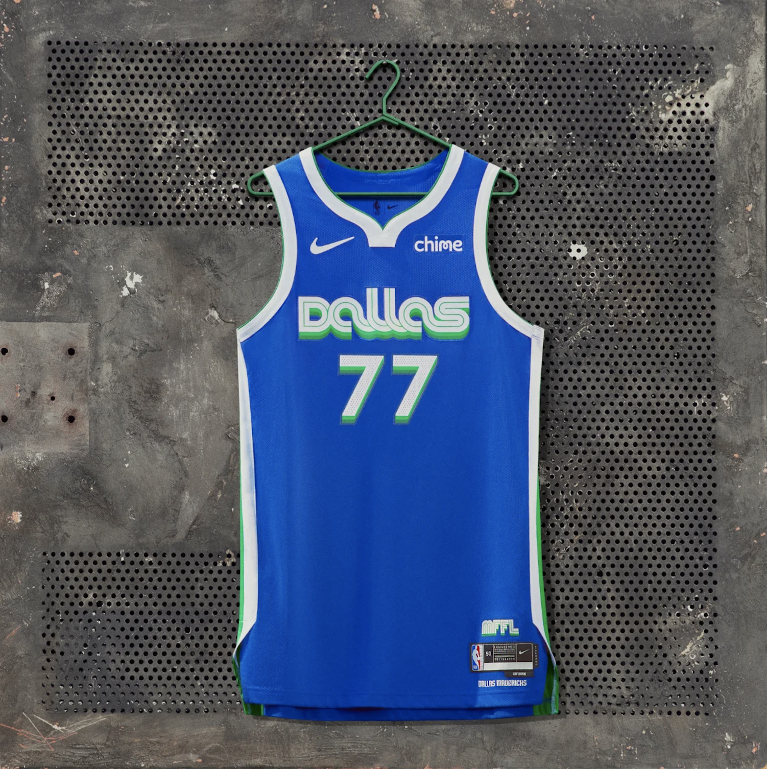
This Jersey has all of the regular Mavericks colors but manages to find a fun, new spin on the idea. I love the vintage 70s type face. Classy stuff.
Houston Rockets
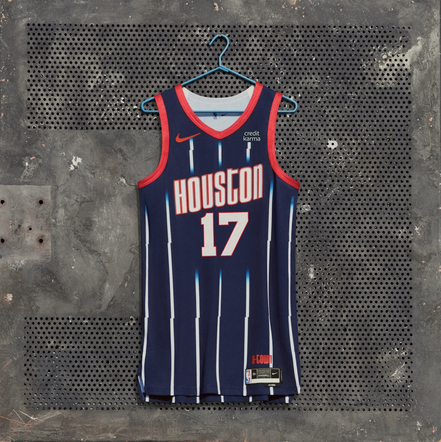
This is a clear homage and almost copy of their jerseys from the mid 90s when they won back to back championships. It incorporates their existing color scheme, reimagines things a bit and recalls a jersey I love. Nice stuff.
New Orleans Pelicans

I love purple so much and I am happy to see that its on a jersey. Now, this jersey does depart from the typical Pelicans colors which should automatically put it a tier below BUT the colors are so clearly a reference to Mardi Gras and it says NOLA on the front that this gets a pass.
Cleveland Cavaliers
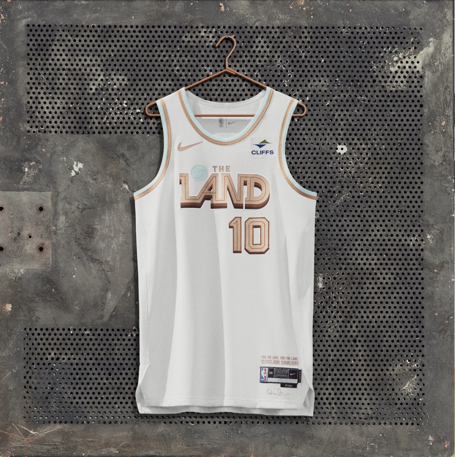
Im into the 1980s Las Vegas shitty but cool digital video lettering on this. The super light blue around the edges is a nice little touch. Calling Cleveland “The Land”, also dope. I had them in the tier below for a bit but the gold-ish orange is actually a player on their regular colors so this passes!
A Tier: Fresh but not Classic Enough
Atlanta Hawks
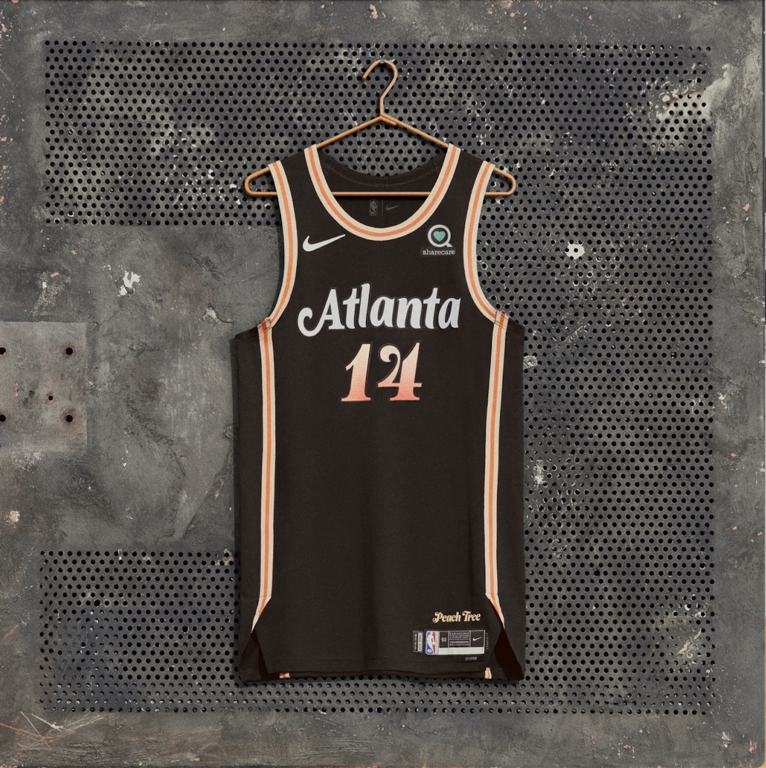
The Peach Tree Uniform has a great color scheme but as you will soon find out i’m not a huge fan of black jerseys. The general design concept just doesn’t fit in with the bright red and yellow you typically see on a Hawks uniform but this is still sick.
Miami Heat
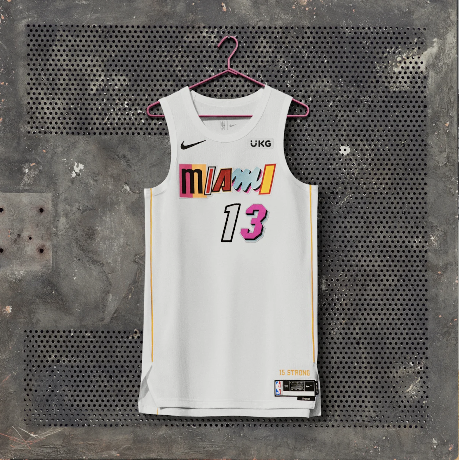
I might get some Heat for this take but i’m into the Miami Vice meets serial killer note vibe of these jerseys. They have such a kooky style that you can’t find on any other pro sport jersey, I mess with it. I also thought it was cool last year how they let the players pick the style of each letter in their last name.
Detroit Pistons

Clean, slick and retro. The colors go nicely together, i’m into the starts and the type face but I just don’t know what this has to do with the Pistons. The Bucks or Celtics should steal this jersey. The pistons are red and blue, not green.
Washington Wizards
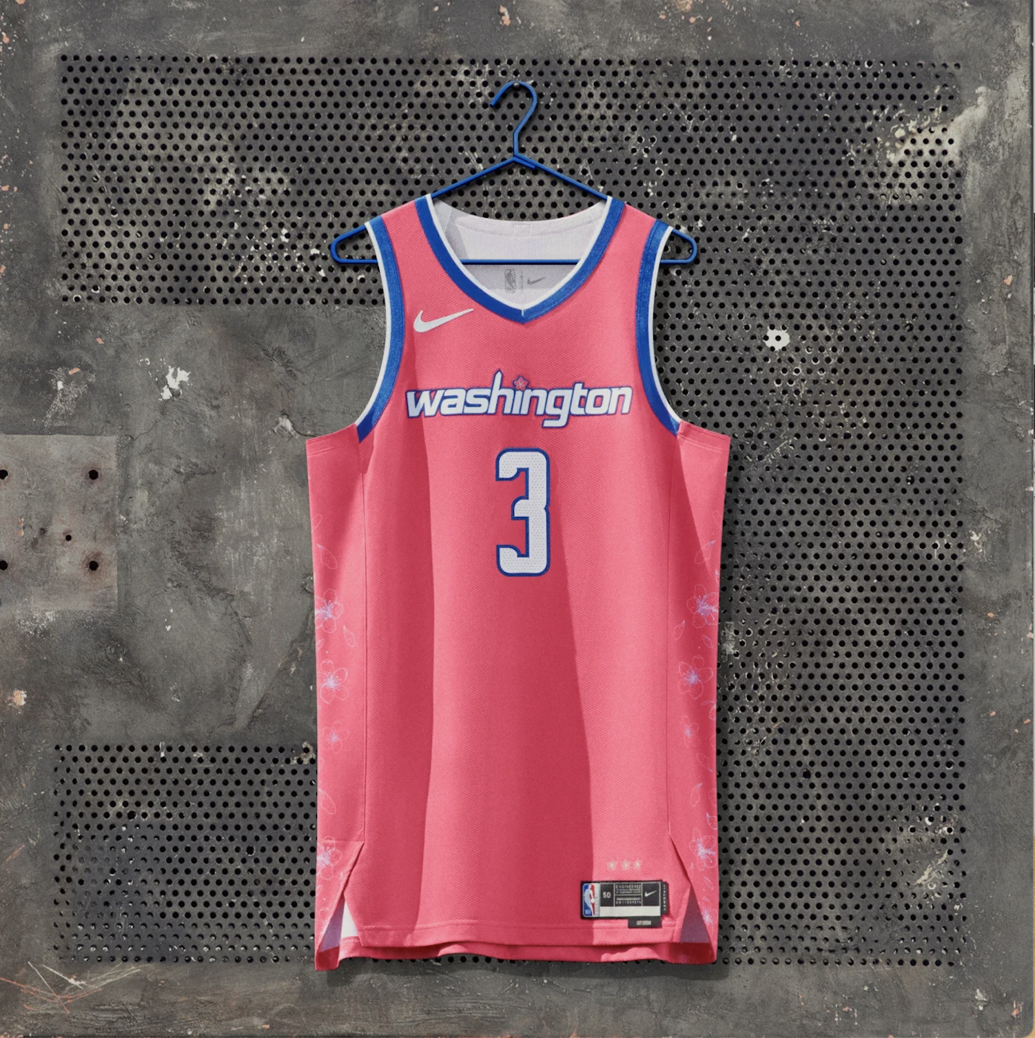
Pink is so much fun and I wish that more teams played around with all of the color spectrum. This is also dope because the Washington Nationals have a cherry blossom jerseys as well. I just wish that this was a little bit more on the regular Wizards color scheme.
Boston Celtics

I used to have these in my top tier because they are so classic but then I decided they were just a bit too boring.
B Tier: Boring but Inoffensive
Chicago Bulls
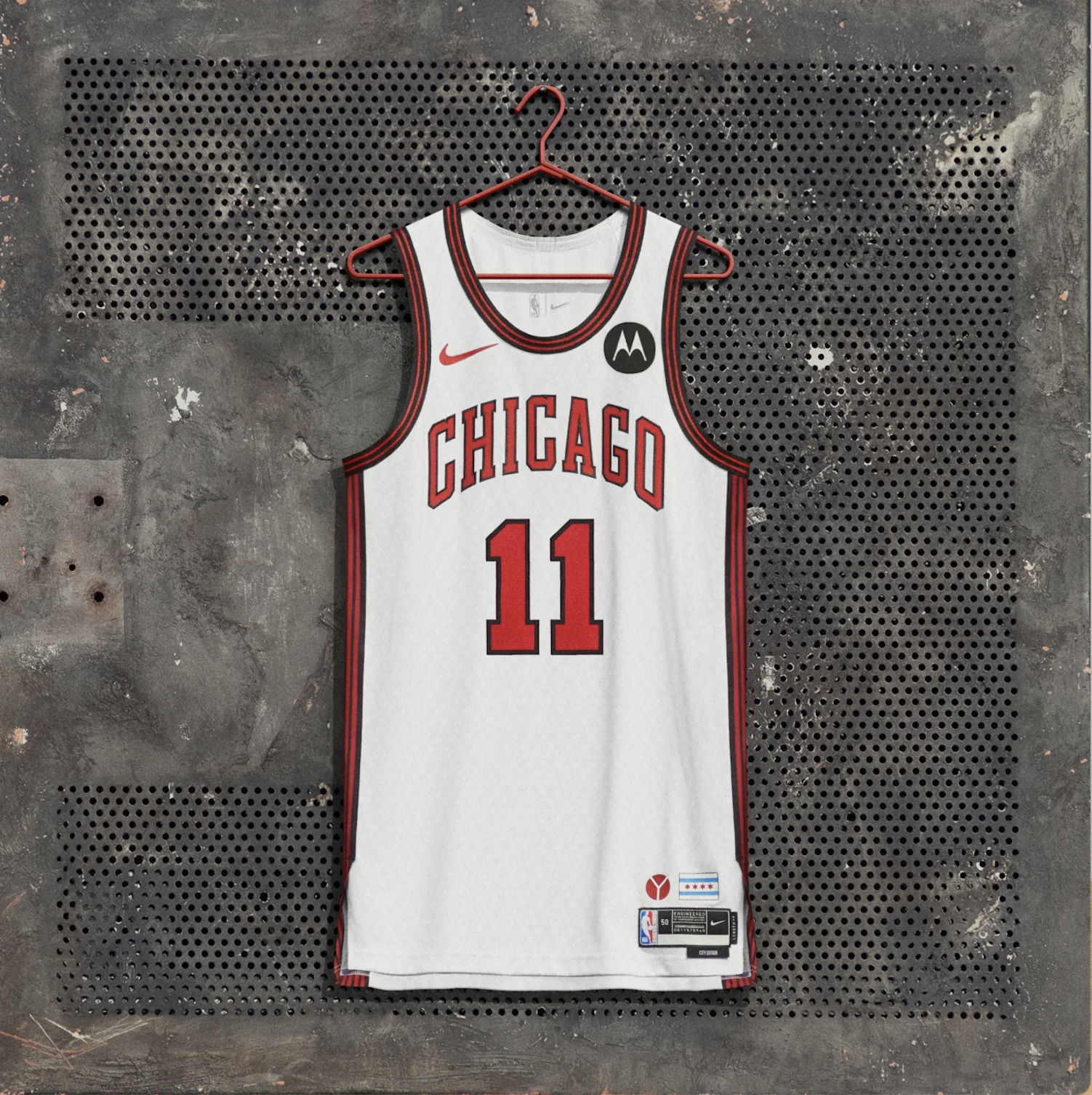
Classic Bulls colors here with a fun little stripe on the side. The little Y symbol in the bottom is a representation of municipal Y which you can see all across the city. I also like the Chicago flag detail. Nothing really too exciting going on here, exemplar of the tier.
Philadelphia 76ers

I had a hard time placing this one. I do love the lettering and “City of Brotherly Love” always gets me going but overall the jersey just feels a bit too minimal. Its verging on the look of a practice uniform. I think just a few more flairs would have helped this out a lot.
Milwaukee Bucks

In a vacuum, this belongs in S or A tier but the Bucks are a GREEN team, not a BLUE team. This is just a middle finger to their existing branding and it tanks the ranking. I think that the Pistons and the Bucks should swap jerseys and both teams would be better off.
Los Angeles Lakers
I really struggled with where to put this one. Ultimately, it goes with the Lakers regular branding and adds in the black which is a nice touch. I am also into the lines going through the letters. However, it is a bit too minimal just like the 6ers jerseys.
Denver Nuggets
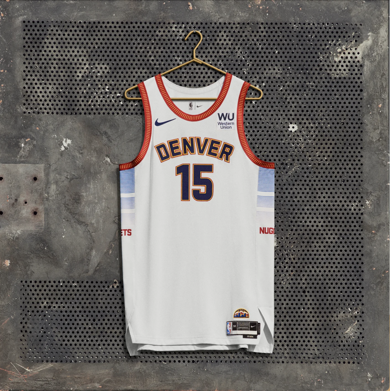
I was not a fan of this at first but it has grown on me the more closely that I look at it. The fading blue lines on the sides is a nice little touch. I like the yellow interspersed with the red around the border. Ultimately, a white jersey with standard type face is never going to be that interesting.
Toronto Raptors
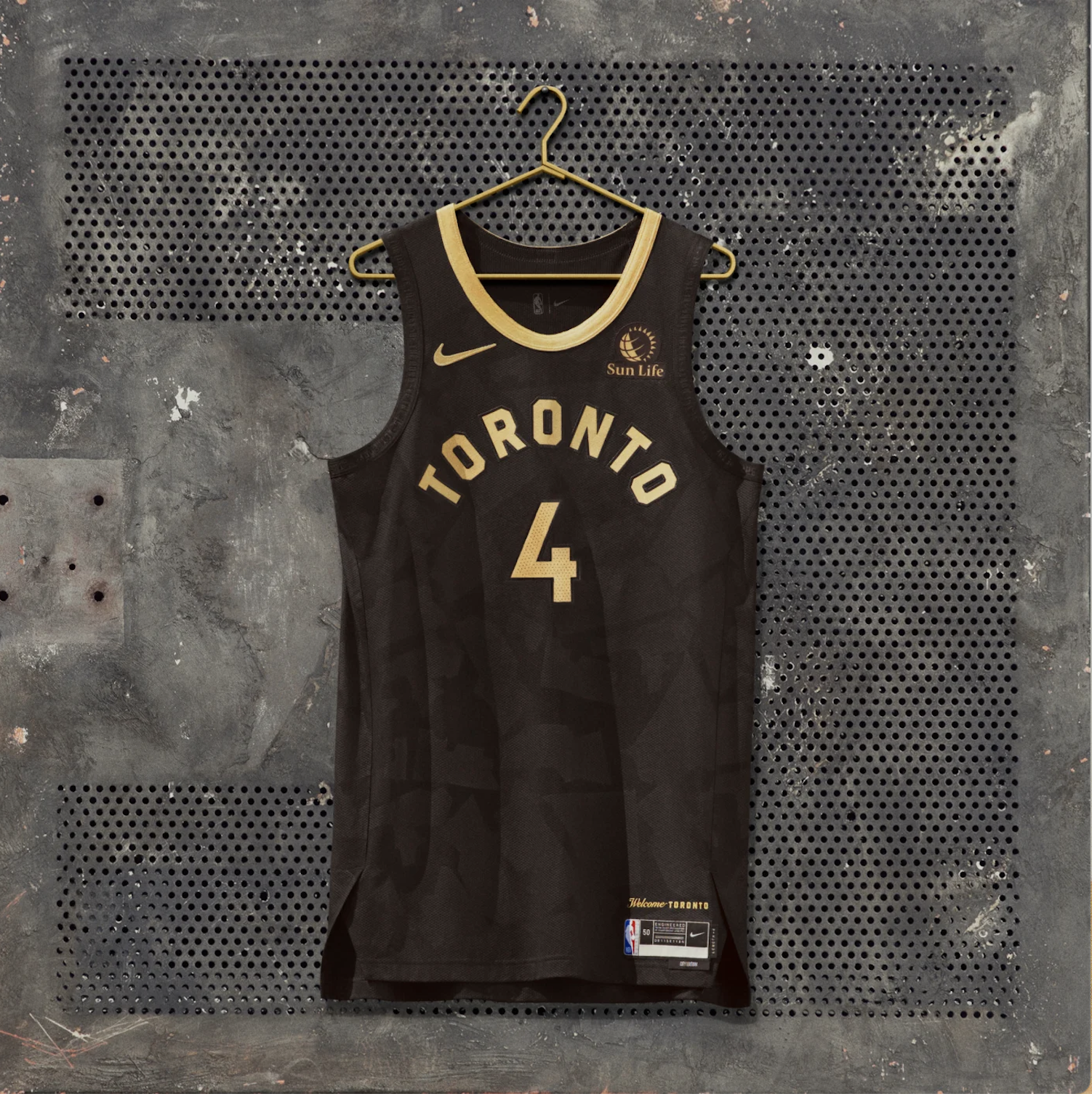
As you are about to find out, this one probably belongs in the next category but I just think it is the best execution of the black jersey. The gold goes great with the black and I am into the little geometric shapes hiding in the background of the black. Now this should be super minus points for violating Raptors branding but they have been doing this scheme with OVO for such a long time that it gets less minus points.
Tier C: Black Jerseys Stink
Im not going to do a breakdown of each individual jersey for this category. They are all lazy and a huge yawn fest. The black largely eats up the rest of the design elements on the jersey or just makes the other elements look freaking weird. When you look at these pictures you might not feel that way but trust that all these jerseys will look very similar on court.
Indiana Pacers

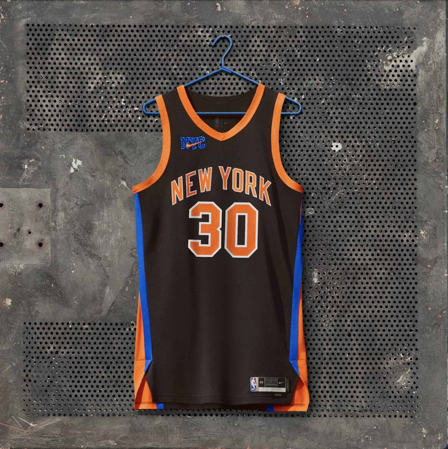
New York Knicks
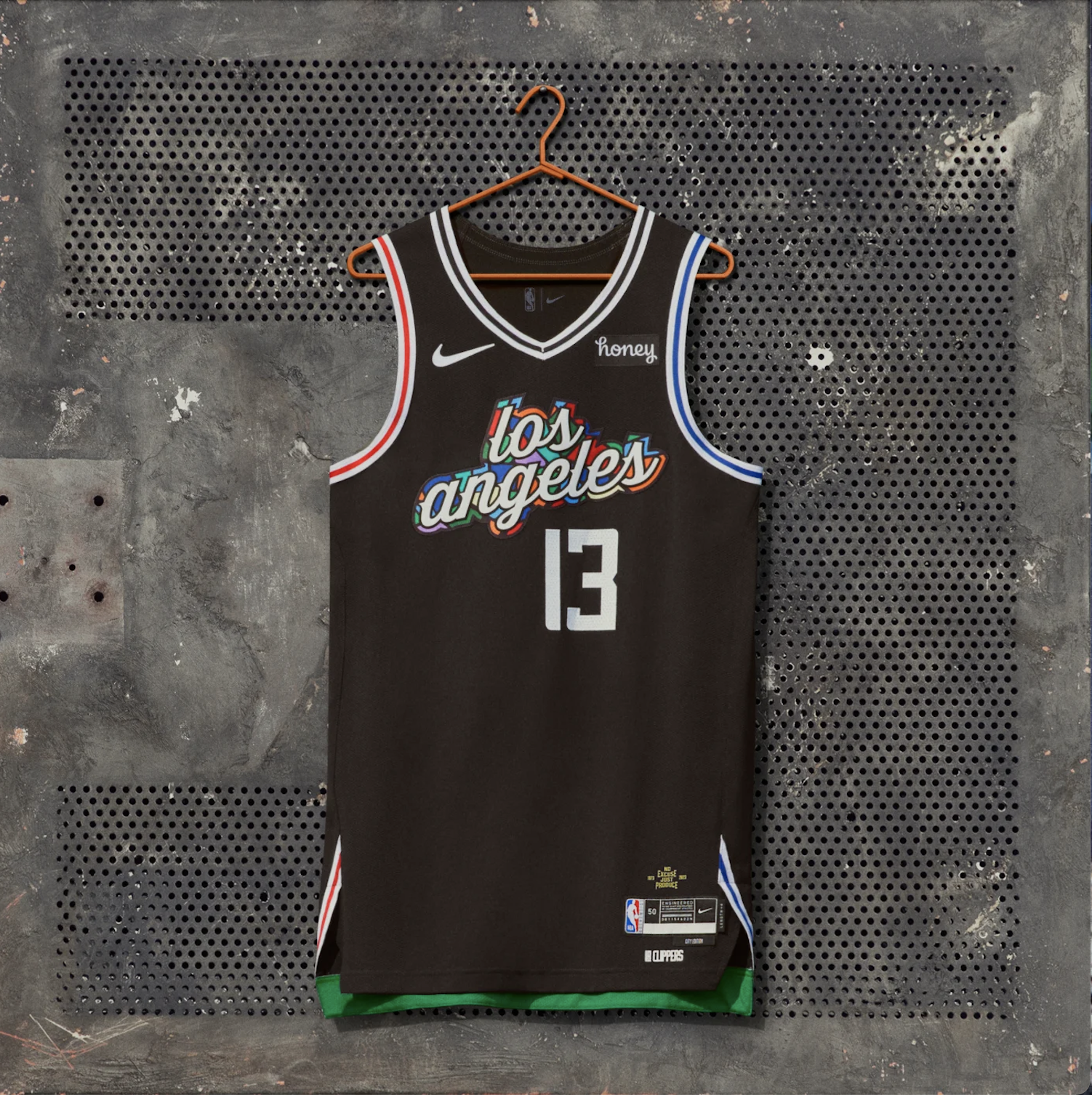
Los Angeles Clippers
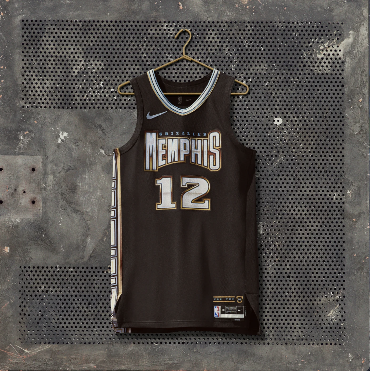
Memphis Grizzlies
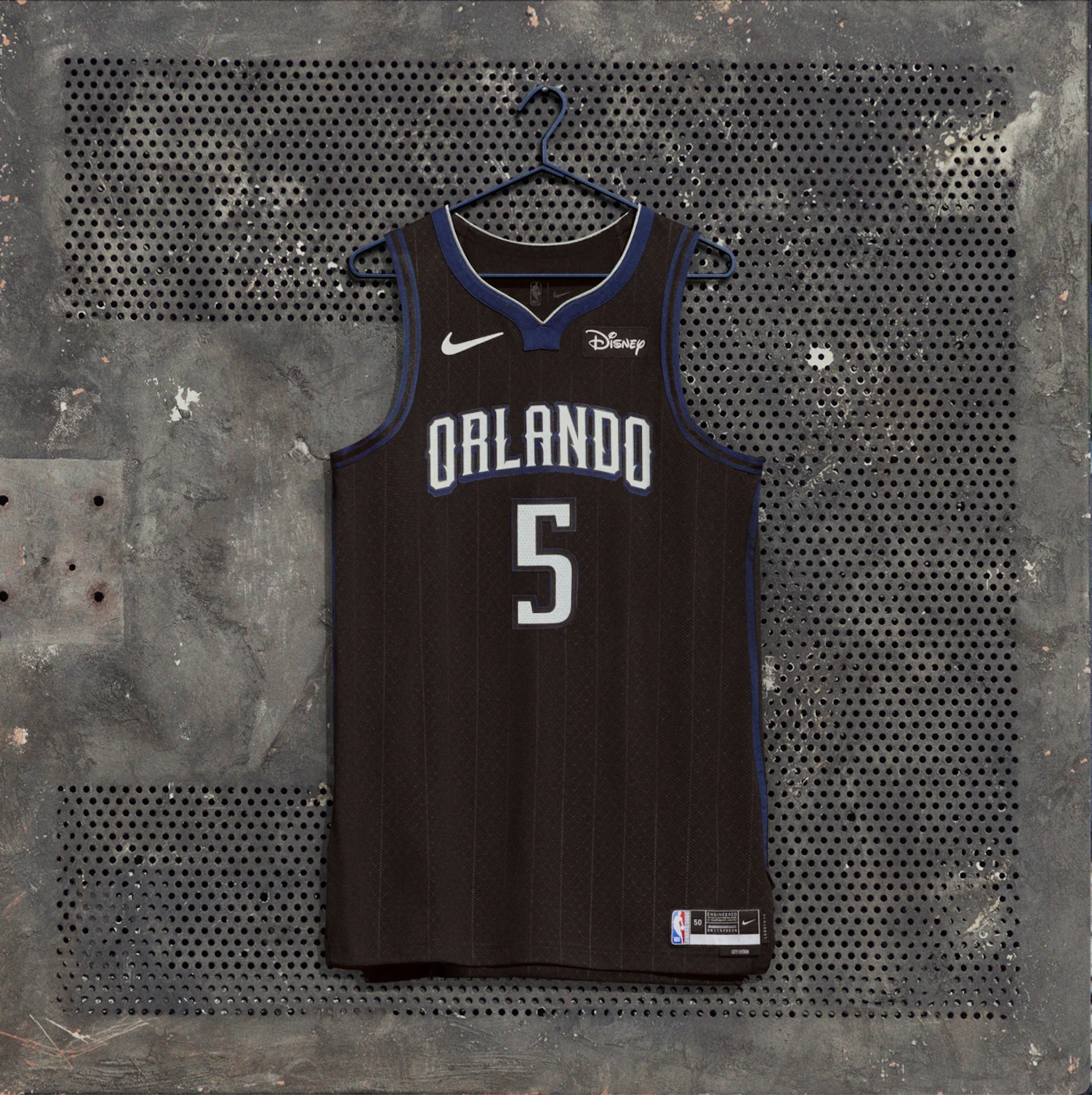
Orlando Magic
Tier D: Category of Woe
Minnesota Timberwolves
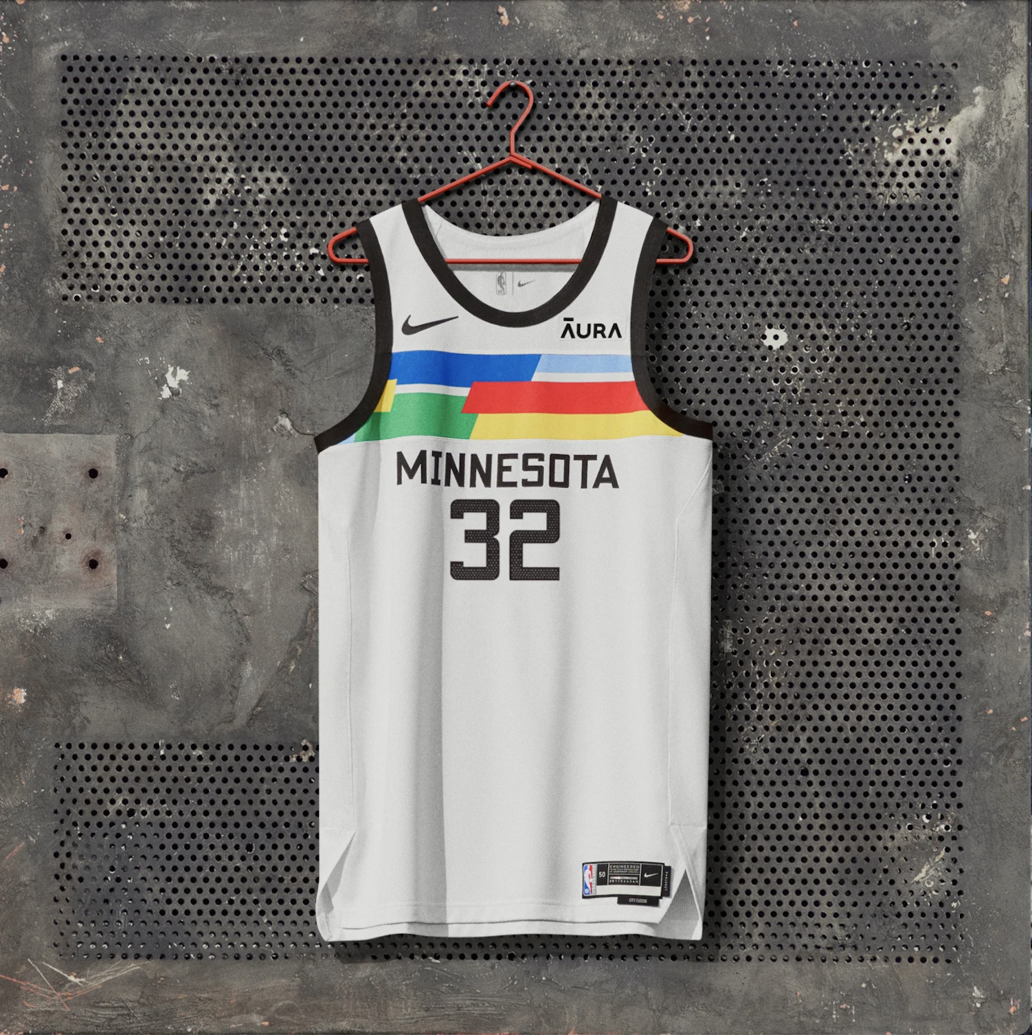
This looks a default jersey in 2K when you are making your own team. I have been using Dall E, the AI art generater, for some of the images on this site and lowkey “Minnesota Timberwolves Practice Jersey in geometric style” gave a better design than this:

San Antonio Spurs

You could convince me that this belongs in F or A tier, i’m super torn. I do enjoy the unique color choices and the funky-cartoonish lettering along with the design on the side but maybe i’m just liking something for being different for the sake of it? Its an homage to their all-star jerseys from the 90s which I also like but lord that bright turquoise is ugly.
Charlotte Hornets
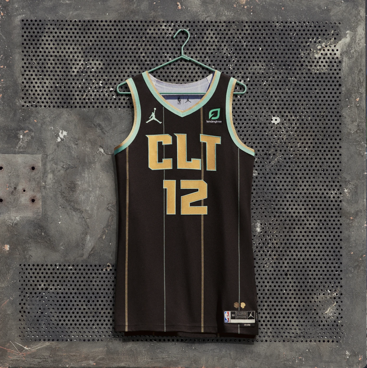
The Internet has been trolling this one hard. Why the hell did they put ‘clit’ on their jersey? That said, the odd pinstripe concept actually looks pretty sick when its being worn and I like the integration of the Hornets colors on the borders.
F Tier: Fire Your Designers
Sacremento Kings
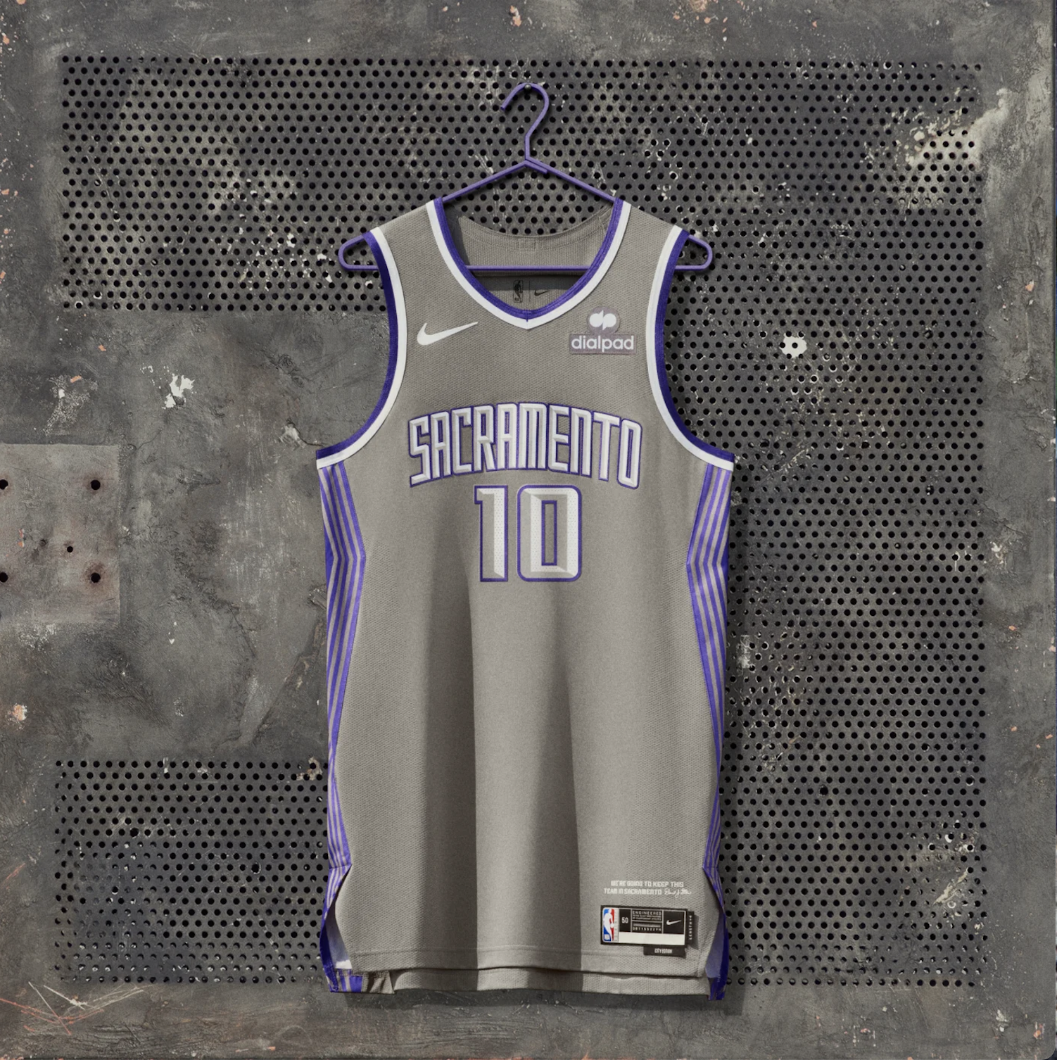
There is nothing that I hate more than the gray jerseys. When the Cavs rolled them out years ago, they looked awful and these look awful too. I like the side stripe thing but can we please have the main color not look the walls of a dimly light and run down office?
Golden State Warriors
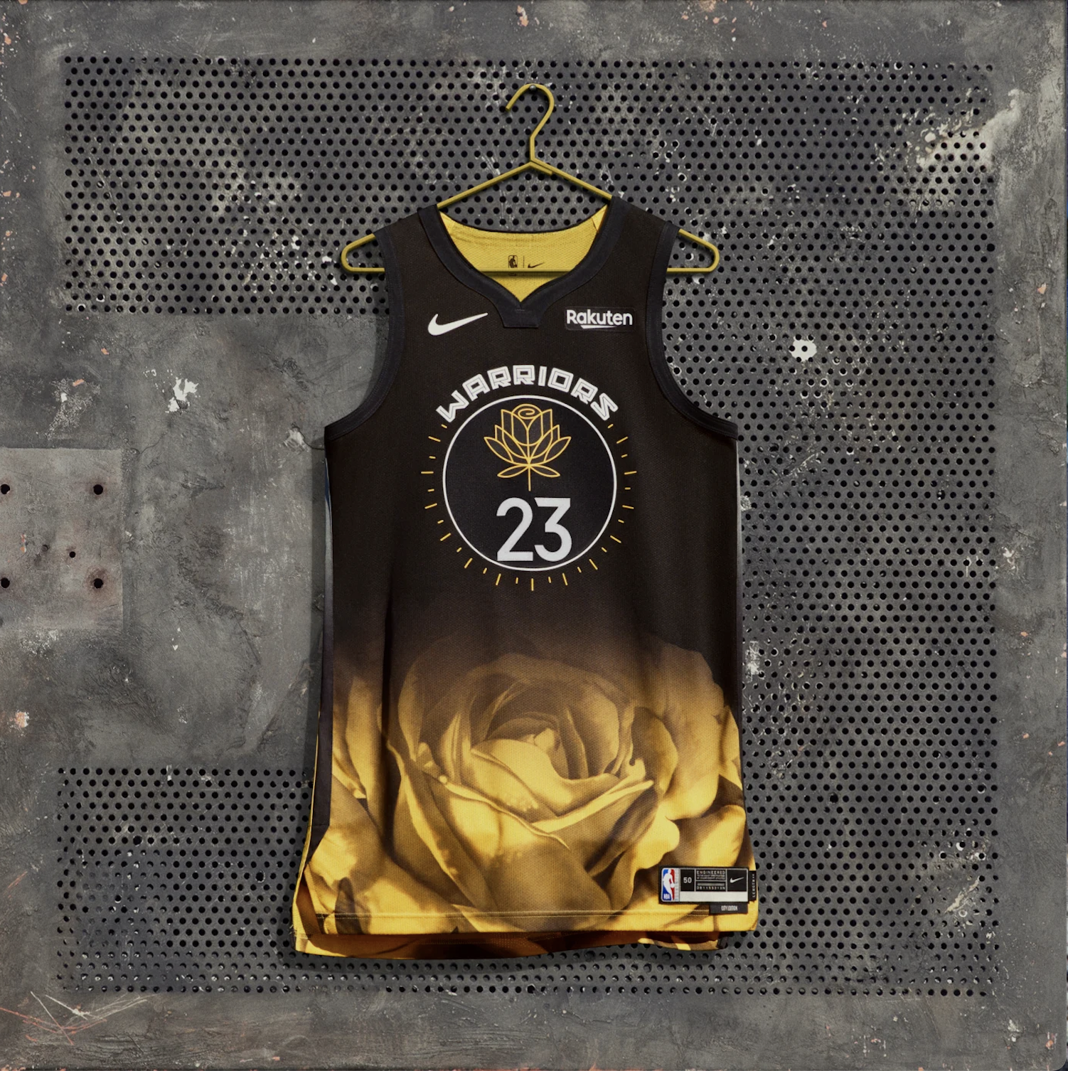
My eyes just jump straight to the insane golden rose at the bottom of the jersey. It’s giving when you are in middle school and you think that gold platted things are the coolest thing in the world and you just google like ‘gold plated Lambo’ or ‘gold IPhone’. Also the whole rose part can’t really be seen when the jersey is worn because players have to tuck their jerseys in. So like, whats the point of this huge ugly thing? Have mercy on the middle school teachers of the Bay Area who are going to have to see this everyday. I hate to say that I do actually kind of like the rose logo and the circle in the middle but it just gets lost.
Oklahoma City Thunder

Hmm how could we make this black jersey better? What if we made the black a bit more grey! Hmm what color goes worst with our Thunder blue? Oh thats right, a dark red! What a genius idea for a jersey! (My eyes actually hurt looking at this)
Portland Trailblazers

Imagine fumbling the bag this bad. The Blazers have one of the coolest logos and design concepts of any team in pro sports. The teal is awful. I don’t know what PDX has to do with Portland. It goes against all the Blazers’ regular design schemes. The stripe through the middle is boring as hell. It’s not yawn, it’s yikes…
Phoenix Suns

Was there some kind of design meeting about incorporating teal/turquoise into jerseys? Did Nike do some market research and find that the people have been thirsty for teal? Where is this all coming from? It saddens me too because this jersey is honoring the indigenous communities in Phoenix who view turquoise stones as having powers of protection. I just don’t think the design comes together at all in the jersey and its a pain to look at.
